What needed to be solved.
The Bull & Bush needed a memorable gastropub identity that could stand out while remaining clean enough for practical collateral and signage use.

A gastropub and wine identity system built around a colourful low-poly bull symbol, flexible colour-bar treatments and business-card applications.
The Bull & Bush needed a memorable gastropub identity that could stand out while remaining clean enough for practical collateral and signage use.
Zest created a bold geometric bull illustration and explored supporting colour-bar systems to build an identity that felt energetic and contemporary.
The final system included logo design, colour-bar variations and business card designs using both white and dark applications.
The work gave the venue a distinctive brand mark and practical identity toolkit for hospitality collateral.
These selected visuals show the quality, direction and practical output of the project in a clear, focused way.
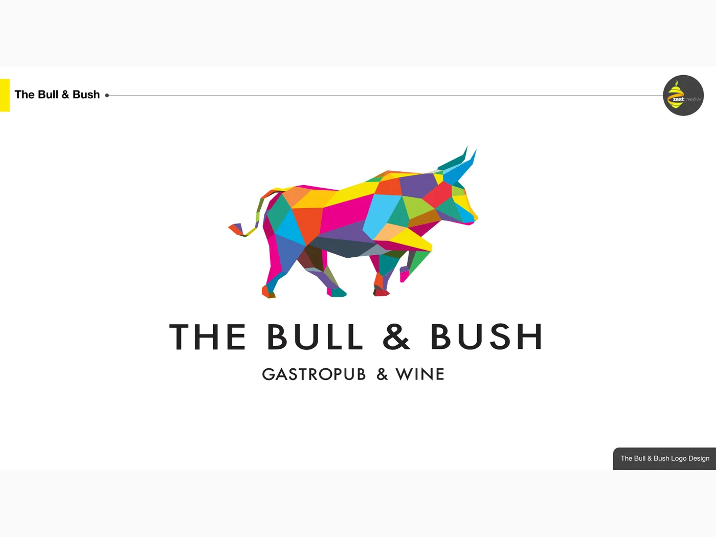
The work gave the venue a distinctive brand mark and practical identity toolkit for hospitality collateral.

Brand strategy, positioning and identity design for new brands and businesses ready to rebrand.
Explore service
Signage design, wayfinding, production and installation coordination for hotels, residences and commercial spaces.
Explore service
For companies that need polished sales and communication materials.
Explore service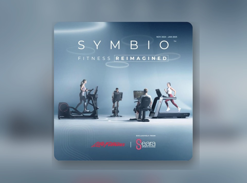
A premium B2B launch ecosystem repositioning SYMBIO as a luxury, hospitality-ready wellness choice through strategy, content, paid media and measurable campaign journeys.
View case study![[stan] campaign identity image with Show your love. Save the world message](/assets/img/projects/stan/thumb.jpg)
A digital launch case study for a fan-tech platform, turning a complex product into a market-ready entertainment brand with measurable awareness, traffic and app-install growth.
View case study
A launch and immediate digital rebrand programme for an existing Bangkok office and warehouse compound, replacing scattered legacy content with consistent new messaging.
View case studyTalk to Zest about strategy, design and practical delivery for your next launch, campaign, signage project or brand environment.